It’s important to create good looking Instagram profiles, that way when someone organically sees one of your posts and clicks through to take a closer look you want to give your visitor reason to drop you a follow!
And there are loads of different methods, all of which take a varying degree of planning:
- The Same Filter Method
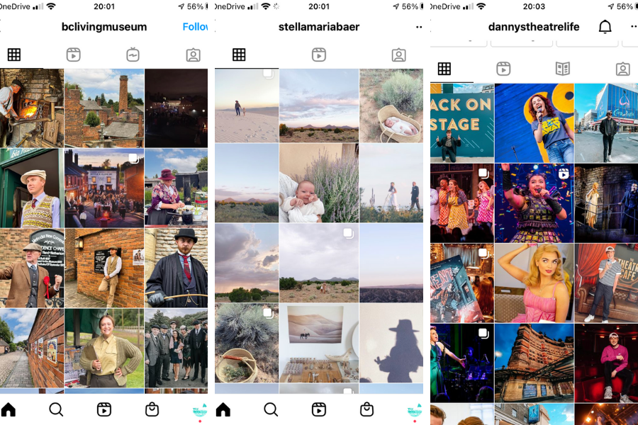
An easy method to tie your Instagram account together. Pick a filter which you feel suits your brand and every time you post, use that filter on your pictures. That way, whatever they are, you tie them together in a similar vibe.
Check out: @bclivingmuseum @stellamariabaer @dannystheatrelife
- The Diagon-alley Method
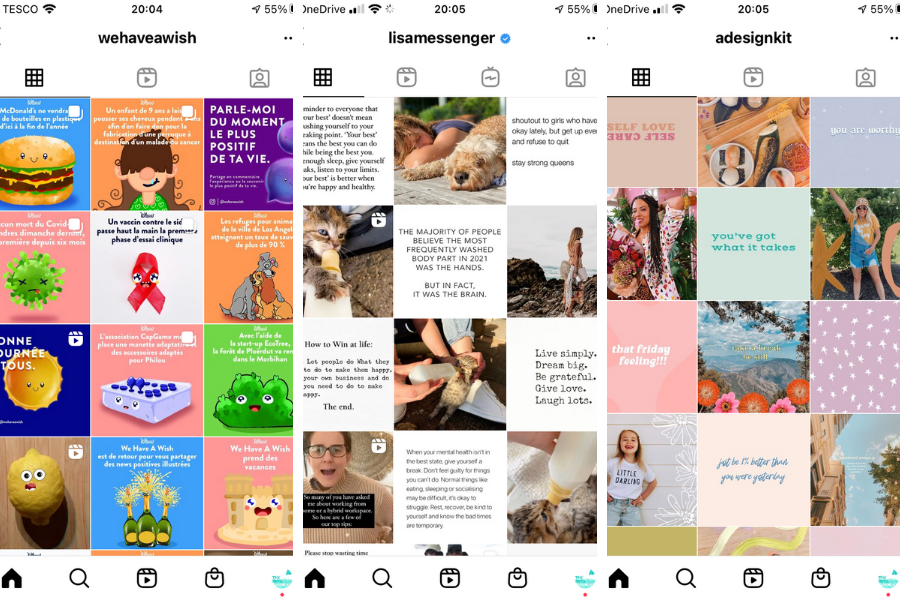
Tricky to plan, this involves taking 3 linking posts (whether this be in colour, quote or subject of photo, etc.) and creating your posts so they appear diagonally on your feed.
As you can see, @adesignkit uses patterns, quotes and pictures. @lisamessenger uses quotes alongside differently themed pictures whereas @wehaveawish simply use colours to create a diagonal line in their feed.
This can be tricky because when planning this to create the diagonal you really have to think about what posts you’re putting out in what order to create that visual.
- The Checkerboard Method
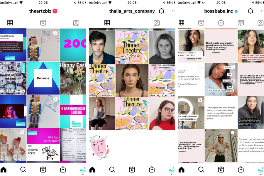
Think like a chess board, here you have two types of visual content and alternate which one you post each time to create a checked pattern in your feed.
@thalia_arts_company have done this by posting their most recent show logo followed by a photo. @bossbabe.inc alternates between quotes and photos. Here at @theartzbiz we have adapted this to suit our brand so we post a photo and then content on patterns and blocking of our brand colours to create the zig-zag.
- The Row-by-Row Method
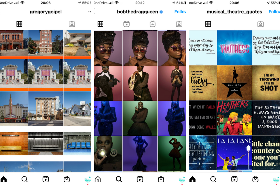
Stack your posts like you’re stacking shelves in a supermarket, row by row. You can really play with this method, get those creative juices flowing to decide exactly how you’re gonna form your rows.
@bobthedragqueen uses colour to pull together their fabulous headshots. @gregorygeipel takes architectural pictures of buildings and either uses similar backgrounds or a single panoramic split into three separate posts to create his rows. @musical_theatre_quotes uses the logo of the musical they are drawing quotes from in the centre which are then displayed in inkeeping branding on eitherside.
Remember to keep this theme looking slick you ideally have to post all three at the same time which could mess with your posting algorithms but makes your profile super appealing to anyone visiting.
- The Column-by-Column Method
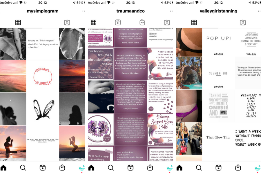 Like the row-by-row but it’s more like you’re building the foundations for the roof of the acropolis, or composing a visual newspaper article.
@mysimplegram almost creates a row and column system with two thematic photos around quotes or images on a white background. @valleygirlstanning provides two columns of quotes and one column of photos. @traumaandco always keeps their central column with exactly the same formatting and puts alternative content either side.
So long as you post the same three type of content in the same order each time the columns will remain the same, they will simply shift to the right each time which means no need for three posts at a time.
- The Rainbow Method
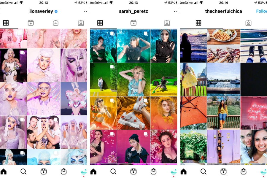
Create a picture-perfect profile by using all the colours of the rainbow in your content! This really helps spread a little joy to your followers and beyond!
@ilonaverley plays the long game in their rainbow profile uploading 3×3 grids of photos using one colour as a focus then follows it with the next colour in the spectrum. @sarah_peretz does her rainbow effect row by row seamlessly blending from colour to colour. @thecheerfulchica posts differing colours from image to image, slightly less stringently than the others but still to gorgeous effect.
- The Colour-Coded Method
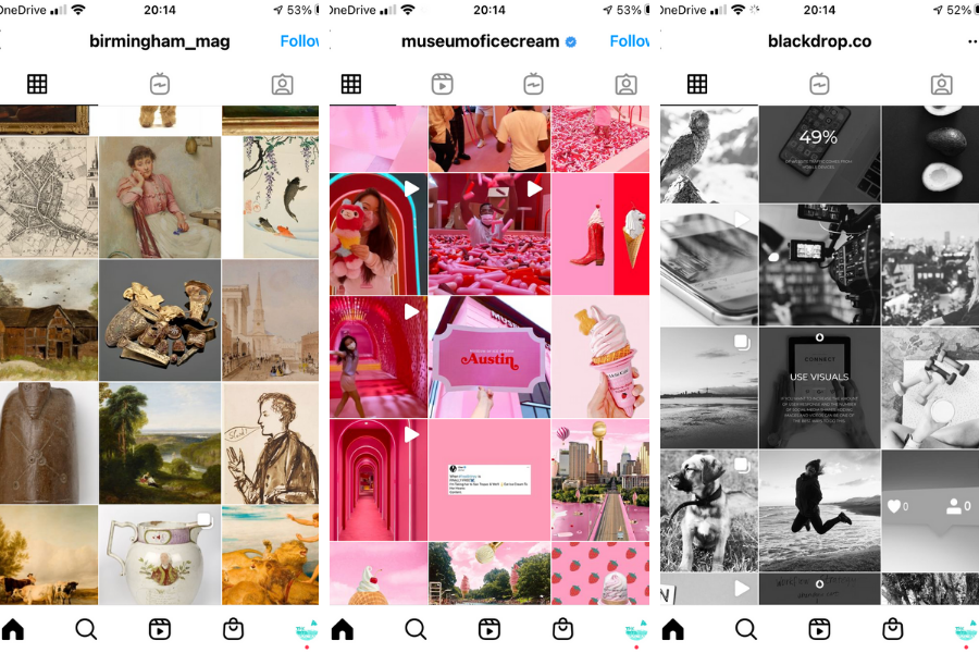
Similar to the rainbow but picking out one colour which suits your brand! So every post has the colour theme in common.
@birmingham_mag consistently uses beigy tones to tie in their paintings and artifacts. As managers of museum and art galleries across Birmingham, it helps that many of their pieces are already displayed on a white background. @museumoficecream has gone with vibrant pink which has a way of bringing immediate happiness! @blackdrop.co goes for classic monochrome pictures and infographics to make their profile look chic.
- The White Border Method
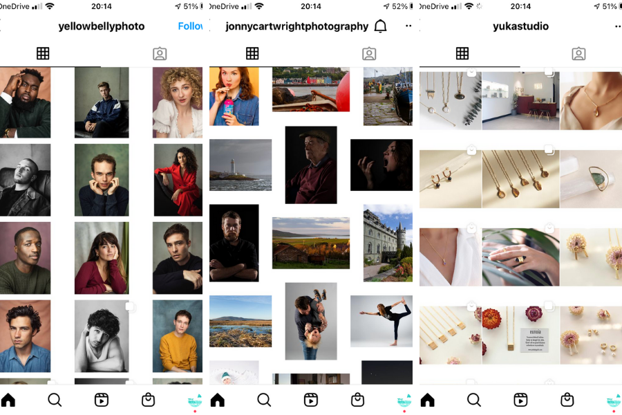
Using a white border around your images on Instagram negates the problem of trying to fit all your posts into a square. I have photographer clients who find this really helpful as often they develop their work in a bespoke size which would have to be edited again for Instagram, so instead they surround their images with a border in their properly proportioned form.
You can create columns (like @yellowbellyphoto), rows (like @yukastudio) or combine the two for a cool looking pattern (like @jonnycartwrightphotography)
- The Grid Method
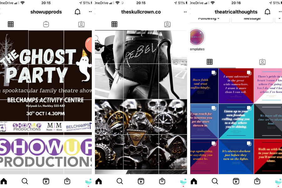
In this method you take a single image and split it into squares using special apps like 9 Grid for Instagram. This can leave some pretty weird single images appearing in people’s newsfeeds, but it makes your profile really striking! So, if you do get users to click through, you’re bound to get them to hit that follow button.
@showupprods has recreated a poster for their Halloween showcase in their 3×3 grid. @theskullcrown.co uses 2×3 grid photos in black and white to show off their awesome bespoke jewelery. Whereas @theatricalthoughts are reimagining the grid. Their quotes work as individual images but come together in grid format to create a beautiful design.
Be careful with this method though as it can really mess with your impressions and interactions as, generally speaking, your posting content less often, but when you do you post 6-9 images at a time which will not be equally viewed.
- The Educational Infographic Method
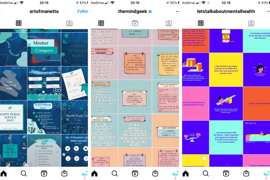
An Instagram profile where the main focus is to enlighten and educate visitors. As you can see our select profiles use brand colour alongside illustrations, quotes, hashtags and information so that users can come away with a clearer understanding of what their profile is about and maybe even learn a little something in a fun and visual way in the process.
You can check out our selected profiles here: @artofmanetta @letstalkaboutmentalhealth @themindgeek
- The Branded Thematic Method
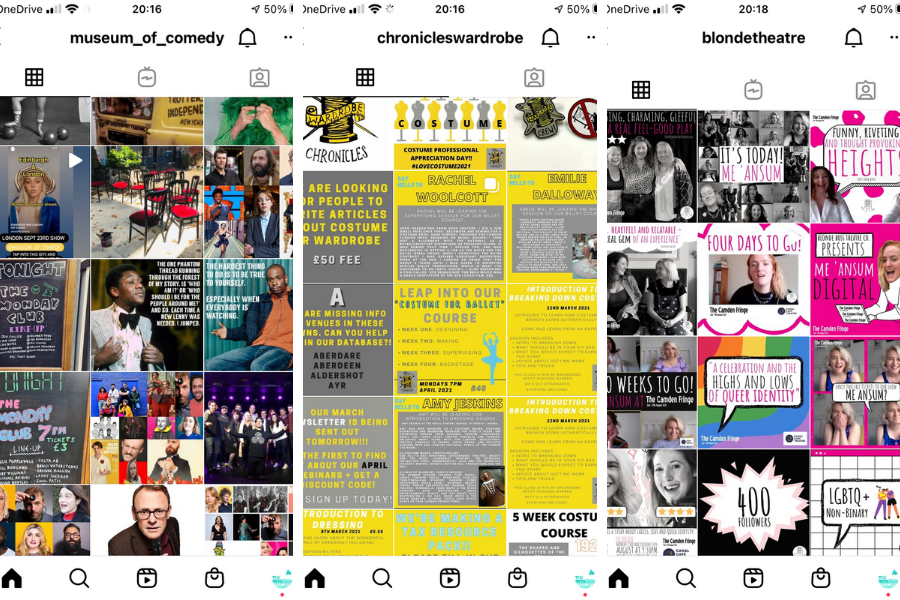
This is where companies use 2 or 3 content types and post them with consistent business branding, whether that’s colours, font, logos etc. You’re not creating a pattern here but by keeping your content thematic it pulls it all together to give a great overall aesthetic.
@museum_of_comedy posts their chalkboards, comic headshots and collages of photos in their feed. @chronicleswardrobe use great infographics, gorgeous illustration and great colour theming to tie in their profile to their brand. @blondetheatre black and white photos and tongue and cheek pop art in black, white and shocking pink making their profile look sick!
- The Collage Method
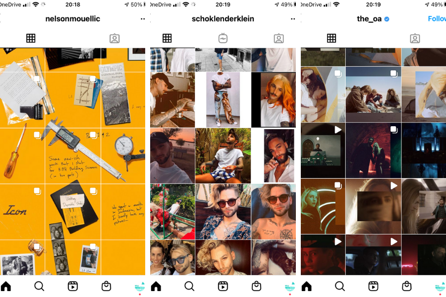
Use a bit of everything! And mix it all up into your own profile design.
Take the following Instagram accounts as inspiration: @nelsonmouellic @schoklenderklein @the_oa_
Remember, in general you should plan your Instagram Posts for the maximum impact. Instagram stories are for more spontaneous moments.
So, why not make it as beautiful as possible?
Are you proud of your Instagram profile? Link us in the comments so we can check it out!