A great way to reach more people with your arts business is to ensure it is accessible to everyone, regardless of ability and the best way to start is by making sure your website is disability friendly.
The most common types of impairments that you need to think about in your website design are:
- Visual Impairment: anyone who is blind, has low vision, requires corrective eyewear or is colour-blind.
- Physical Impairment: anyone who has restricted movement caused by a disability or struggles with certain motor skills like moving a mouse or typing on a keyboard.
- Hearing Impairment: anyone who is deaf or hard of hearing.
- Psychiatric Disability: something you need to be aware of should you have content which may be triggering to someone with mental illness.
- Photosensitivity: users with epilepsy who could have seizures induced from flashing lights.
- Cognitive Impairment: a disability which affects someone’s cognitive functions like dyslexia, dysnomia or dementia.
With that in mind here are The Arts Business’ top tips for making your website accessible
-
Image Tags Alt text
You should be doing this already to improve your SEO but for accessibility purposes you basically want to give a detailed description on what can be seen in the images on your website.
For example, if this is the image you’re using:

Then a good alt tag would be ‘ballet dancer in a forest’. An even better one might read ‘Ballet dancer in black leotard and tutu, standing on one foot en pointe in a forest in the sunshine’. Whatever you do, don’t leave your alt text blank.
-
Colour Scheme
There are a few things to consider here.
Firstly, think about your company’s branding, try to use distinctive colours. Think about shades of colour, for example, if you use indigo and lilac in your companies branding ensure the colours are not two similar shades of purple as this could make your content difficult to decipher.
Next, you must think about a potential user who is colour blind. We’ve all seen the colour-blindness tests, right?
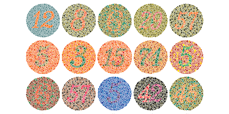
Think about the colours you’re using together and if in doubt of colour combinations, you can refer to the image above. If you want to learn more about different types of colour blindness you can visit the Colour-Blind Awareness Website.
-
Text Sizing
Primarily you want to ensure that your text is an appropriate size, colour and font which is easy to read.
So, for colour, think either light coloured font on a dark background, or a dark coloured font on a light background. I have dyslexia myself and find it much easier to read black text on a yellow background which is also something to take into account.
And it is so important to think about the readability of your chosen font type. Print types of font (serif and sans serif) are generally easier to read than handwriting or calligraphy fonts (script) especially if you’re writing long blog posts, you want to keep the reader engaged. Time is precious and if your audience struggles to read your font, they’re quite simply not going to bother.
Sizing is slightly more complex. Yes, simply put, you want to make sure the size is readable. Think about your target audience here. If your target audience is in the 50+ age range, you will want to have a larger font to start with.
You will also want to check the quality when you zoom in. Ideally, you want your website to be responsive which means that when you zoom in and out the font reformats so that you can still read all the content from left to right. This is more difficult to programme depending on the software you have used to make it, so don’t worry if you can’t do this. Just check it out for yourself on different devices.
-
Device Friendly
Similar to no. 3 you need to check the ability to resize text and imagery across different devices, ideally on a phone and tablet.
You will also want to check your imagery and colour scheme to ensure it is still readable on devices with different resolutions.
-
Closed Captions
This is a simple one! If you have video content, subtitle your work. Most online video platforms like YouTube have editing software to enable you to add subtitles yourself quickly and easily!
-
Tab-able keyboard friendly
Bear in mind that some physical impairments mean that users can’t use a touchpad or mouse so you have to make sure that your website can be navigated through their keyboard.
Don’t panic if you’re not up to scratch on your keyboard shortcuts. The simplest way to check this is by using your up and down arrows to scroll, tab to move between tabs on the page and enter to select links. So long as that works it’s keyboard compatible.
-
Hyperlink Format
When you create a link in a post you want to describe the page it will lead to. You want to avoid links like Click Here or Read Now as they are an accessibility nightmare. So instead of:
Read up on Inside Theatre in our latest app of the month post click here.
Try:
Read up on Inside Theatre in our latest app of the month post
All pretty straight forward and as an added bonus this will also help you with your brand design and SEO!
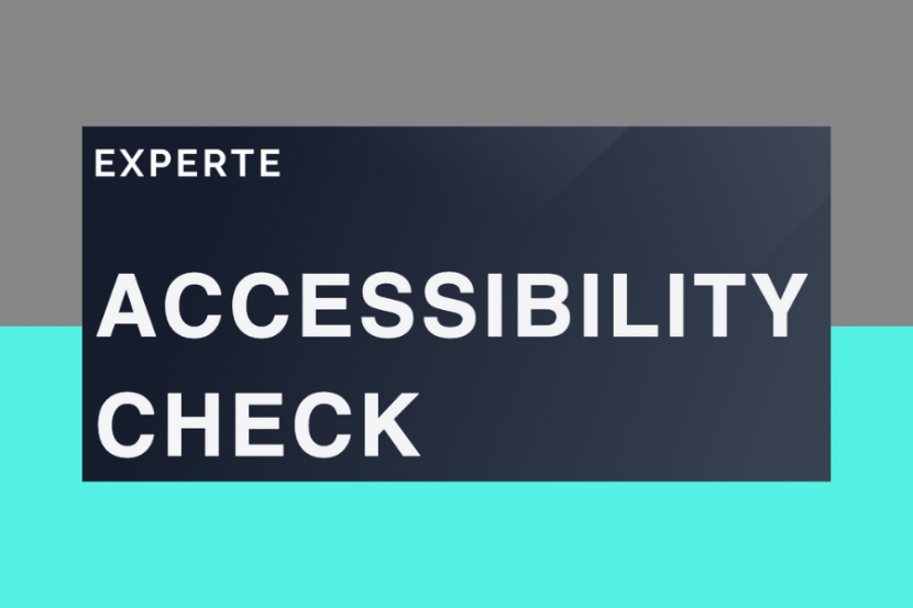
If you want to know how accessible your website currently is just head to the Web Accessibility Website to check your page one by one, or looking at the Experte Accessibility Checker to assess them all at once! Just stick in your address! They’ll outline any problem areas of your website in terms of accessibility.
What have you done to make your website more accessible? Let us know in the comments below!