The Psychology of Colour
We all know it’s incredibly difficult to stand out online and colour can play an incredible part in helping us emerge from the crowd.
Colours can be used to invoke diverse emotions and feelings so it is very important to consider exactly what our content and branding is projecting to our audience.
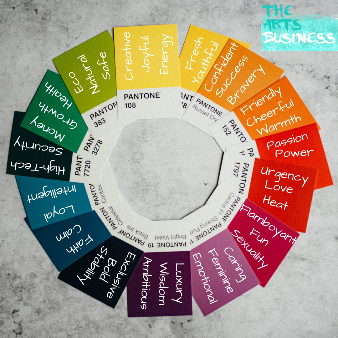
The Arts Business has created a Colour Wheel and table to give you an idea of the different kind of information that is conative with different colours.

| YELLOW
· Creative · Joyful · Energy · Fresh · Youthfulness |
ORANGE
· Confidence · Success · Bravery · Friendly · Cheerful · Warmth |
RED
· Passion · Power · Urgency · Love · Heat |
| PINK
· Flamboyant · Fun · Sexuality · Caring · Feminine · Emotional |
PURPLE
· Luxury · Wisdom · Ambitious |
BLACK
· Exclusivity · Bold · Stability |
| BLUE
· Faith · Calm · Loyal · Intelligent |
GREY
· High-Tech · Security |
GREEN
· Money · Growth · Health · Eco · Natural · Safe |
Different shades of these colours can also suggest different things for example lighter, pastel colours are seen as calming and serene whereas bright, more vibrant colours induce energy and enthusiasm.
When thinking about the branding of your arts business you will also want to consider any important call to action buttons or clickbait, ensuring they are in a contrasting colour to the rest of your website so it stands out to your consumers.
And there you have it, well, sort of. Obviously, there’s a load of psychological reasoning behind why we feel certain ways or associate things with different colours and should you choose to google it you can spend hours in the rabbit hole of why!
But the important thing is to recognise the significance of colours to use them effectively through the branding of your arts business!
What colours do you use for your branding and why? Let us know in the comments!
To learn more about branding you should check out our post on how to create a Brand Book for your arts business.

