As your business expands so will you staffing base and it is important when you bring newbies aboard that they fully understand your company and your brand.
It may even be useful to have when you’re starting out as it can really resonate clarity in your presentation. If you create a system of branding rules to stick to then your website and marketing material is bound to look super profesh!
A Brand Book can be an excellent way to not only create your parameters for your brand but also format it in such a way that is in keeping with your company’s branding. This not only gives your presentation a clear vision but also allows others who join you, whether freelancers or employees, to quickly gain a full understanding of your business’ branding.
You may want to consider hiring a professional (like The Arts Business) to pull together your brand properly, especially if there is no one on your team with a graphic design edge. This document makes a statement for your entire operations so it’s important to get it right.
But, as I’m sure you know by now, here at The Arts Business we are firm believers in Doing It Yourself!
So, here’s how to make your very own! You can pick and choose the aspects of Brand Book you want to enclose and as you grow, it can grow with you.
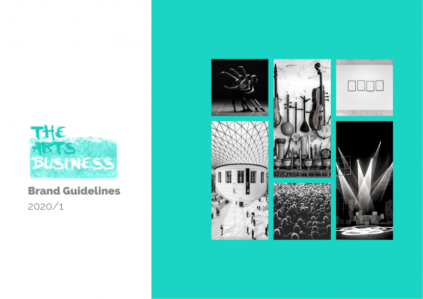
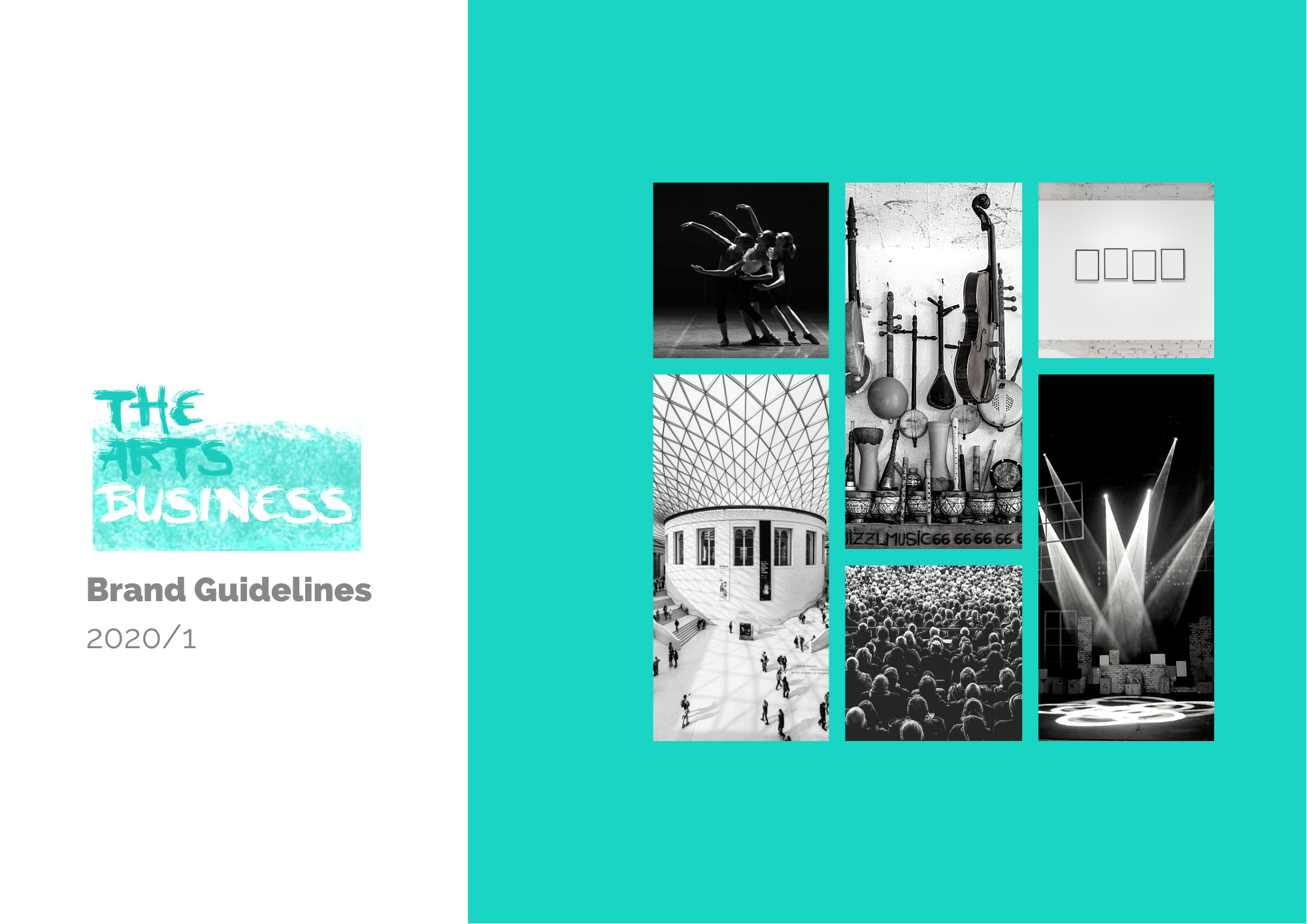
I’ll be working off The Arts Business’ very own Brand Book’s included sections and how to write them. Here is our lovely front cover!
Click here to download The Arts Business Brand Book to follow along, use as reference or simply admire.
I will also chuck in some bonus headings you can include. Just pick and choose which ones are best suited to you and your business.
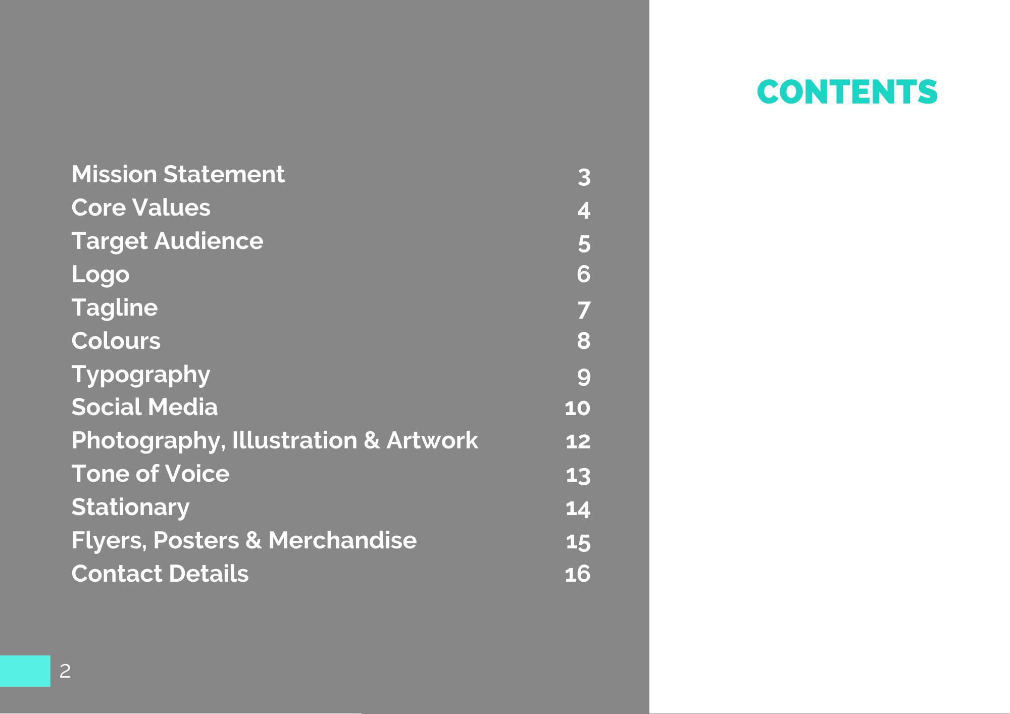
- Contents
Direct the reader to each section at the beginning. Simples!
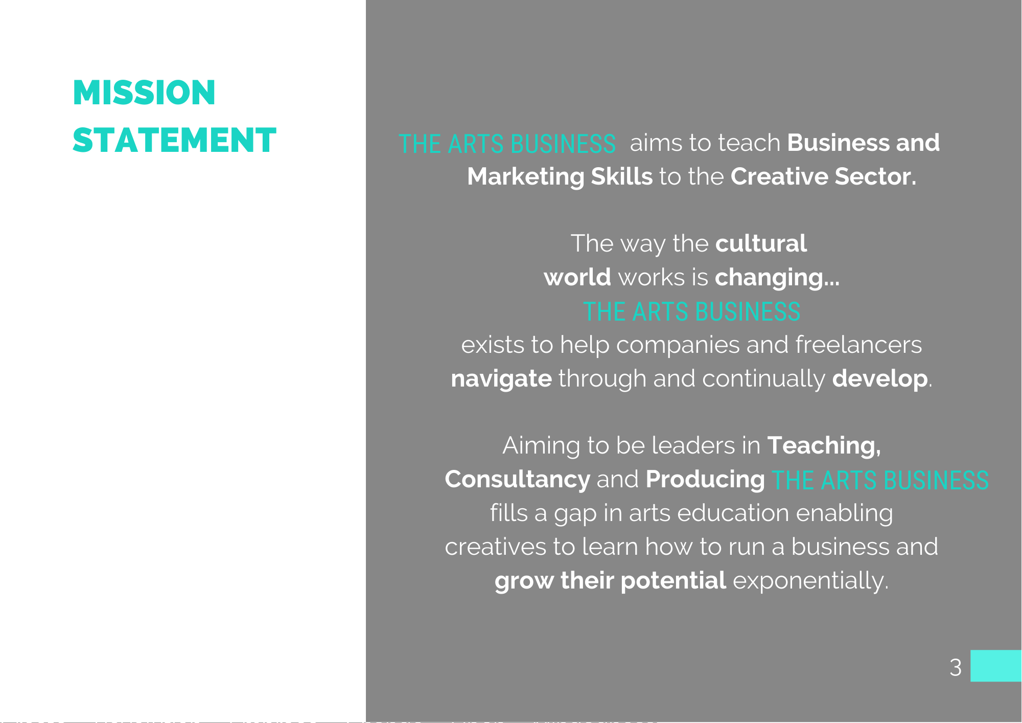
- Mission Statement
Kick start the book with what the brand represents. Officially it is a formal summary of the company, but I like to think of it as a series of bullet points telling the reader immediately what the company does and its goals.
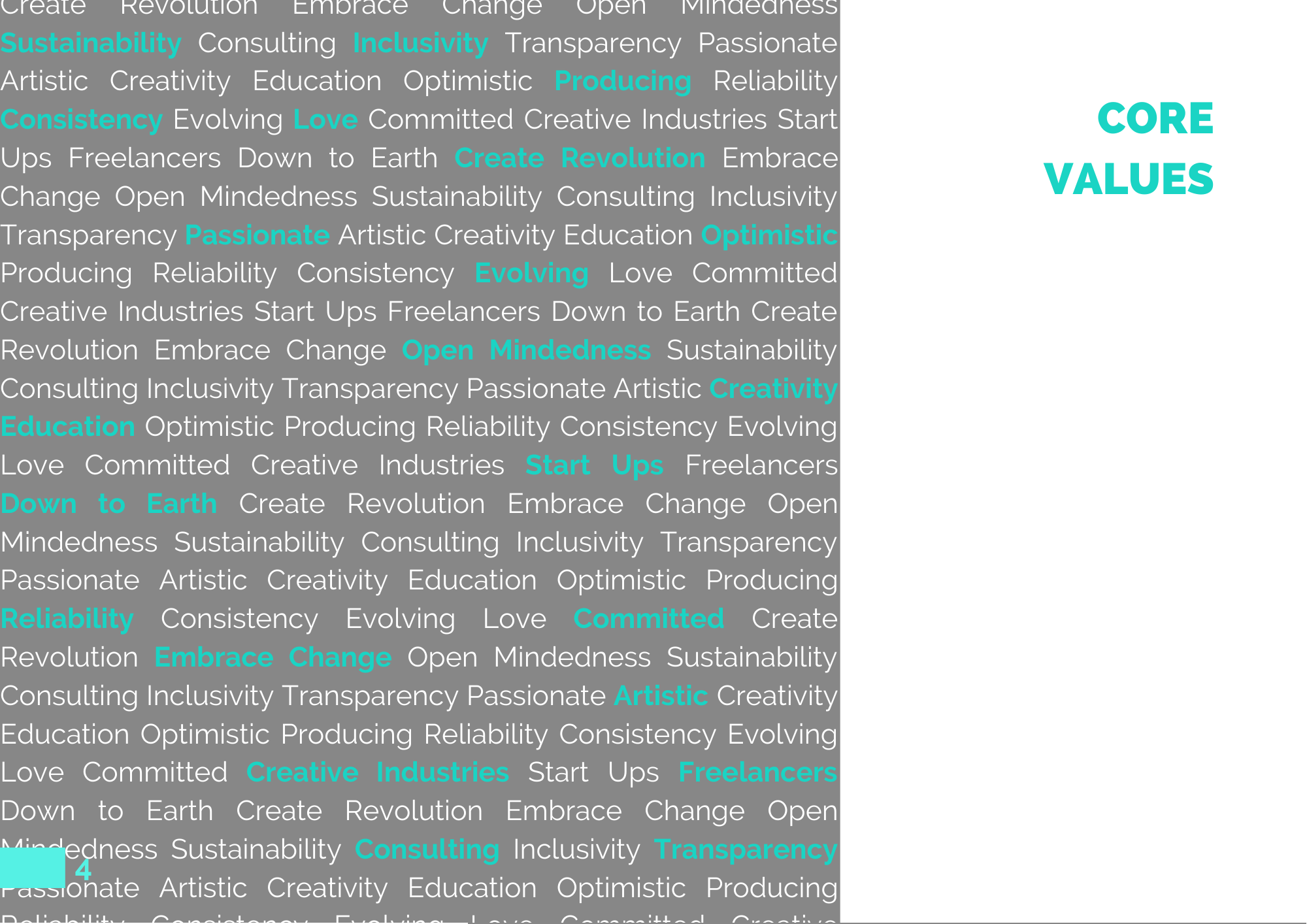
- Core Values
Single Words or phrases that ring true with your company and its aims. Have fun with this page. Really let your imagination run free with your design!
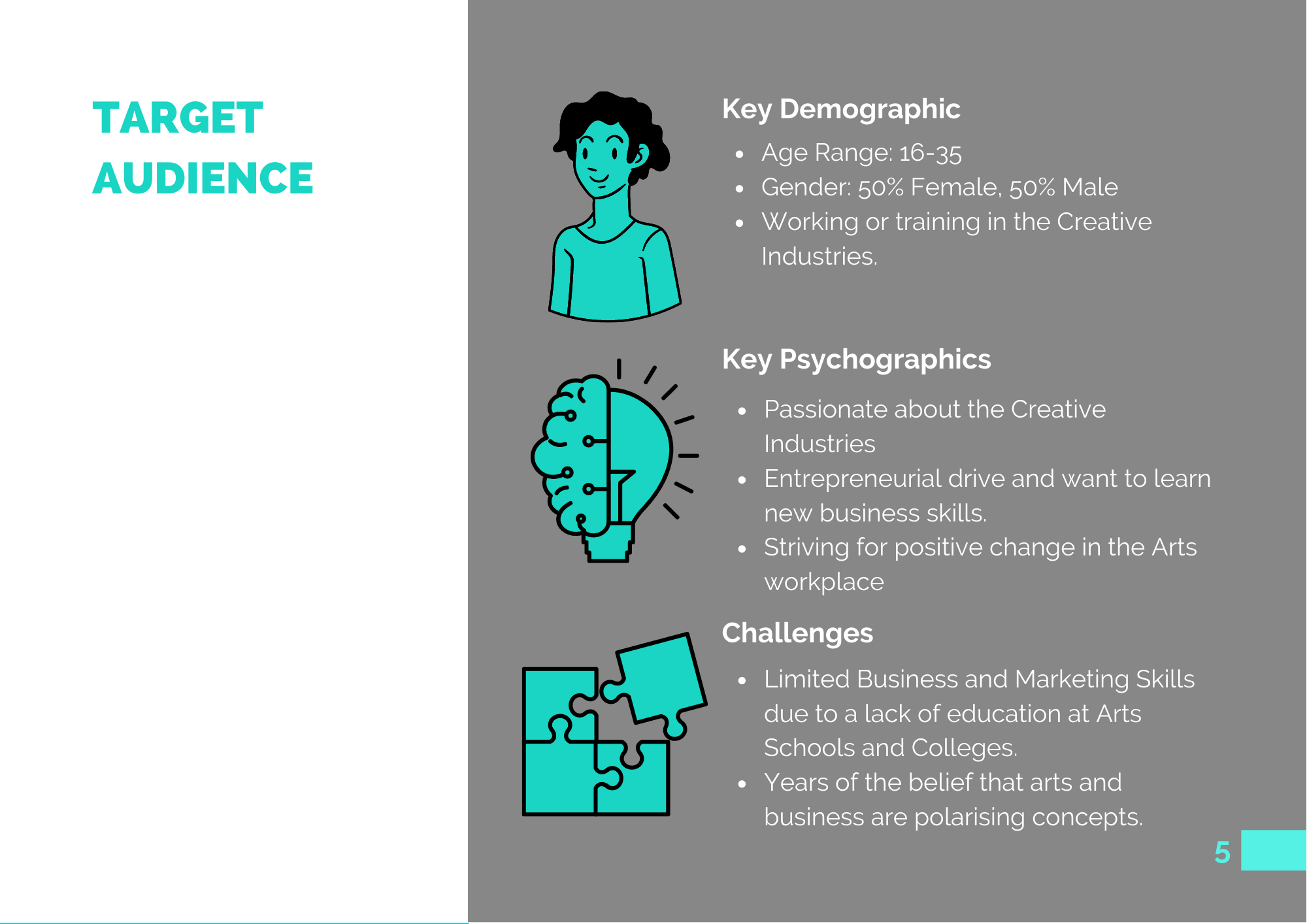
- Target Audience
Who are you trying to reach? This is so important to define as it will not only make your vision clearer but will help you to design growth and marketing strategies to ensure that your business is reaching the right people.
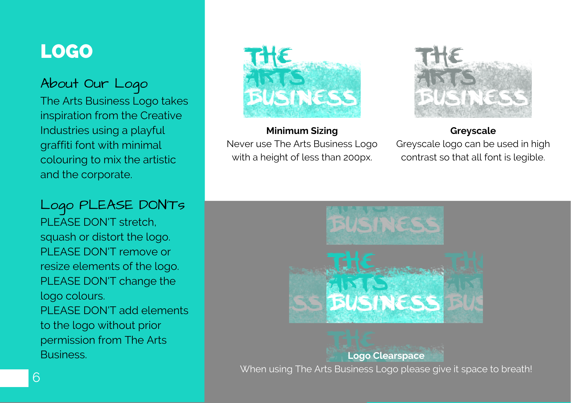
- Logo
Not only are you showing how your logo is displayed in colour, greyscale and how much space should be allowed around it but also any dos and don’ts for your logo. For example: don’t stretch or distort the logo, don’t recolour the logo. Don’t be afraid of details, your logo is one of the most important aspects of your brand and you want to make sure it always stands out.
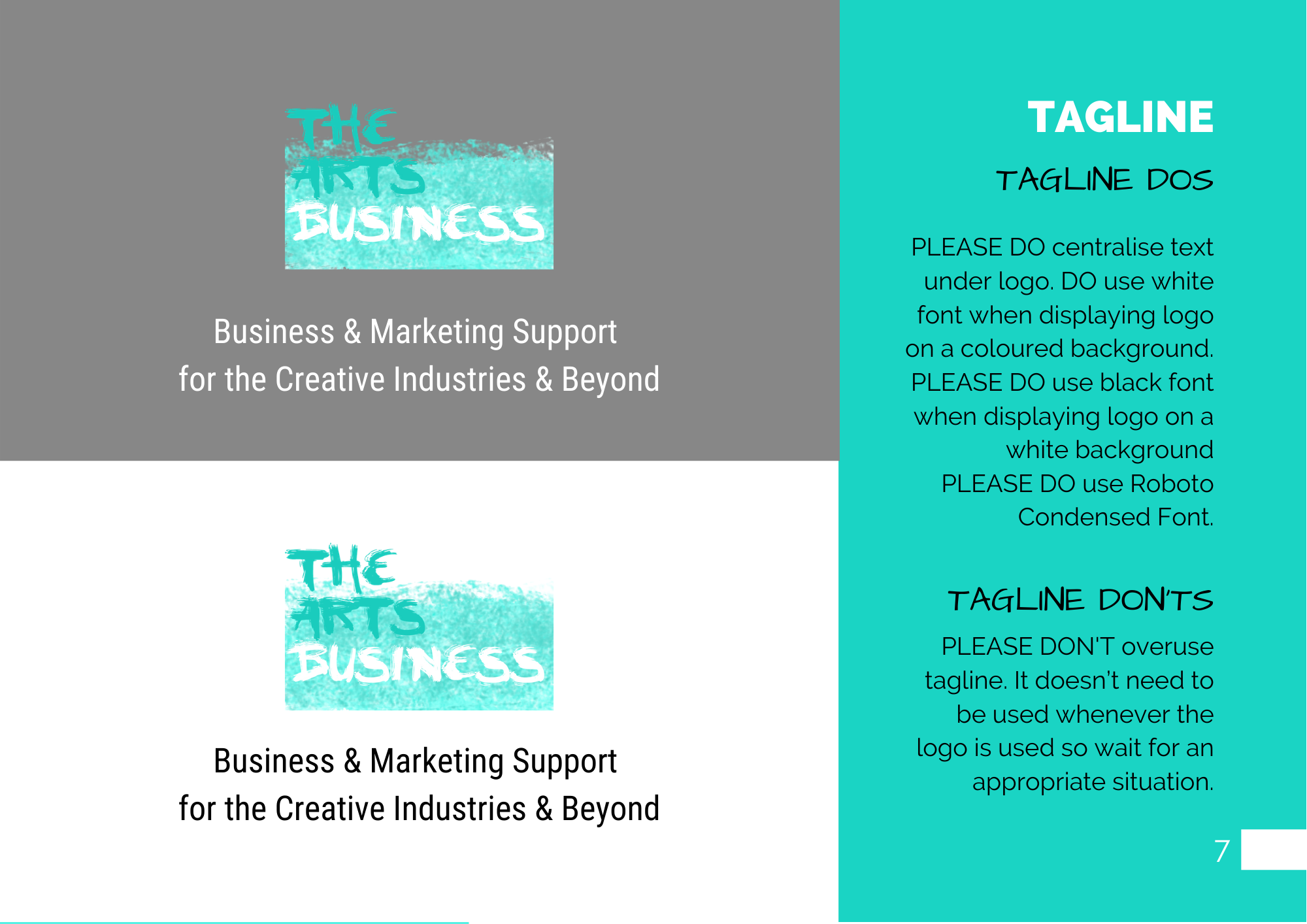
- Tagline
Think of this like your company slogan. When starting out you want to make sure your tagline clearly explains what your company does, really spell it out for anyone who stumbles across your page organically! Here is your opportunity to display how you want your tagline to tie in with your logo and those ever so important dos or don’ts.
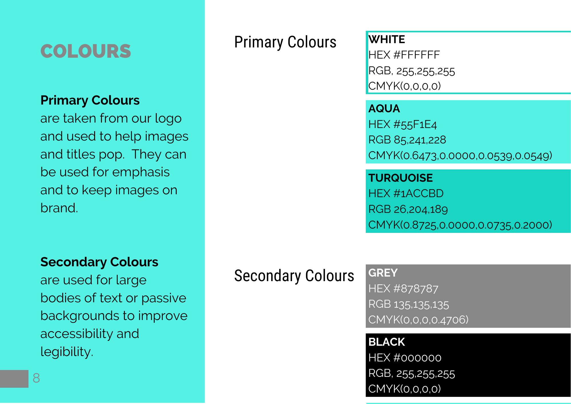
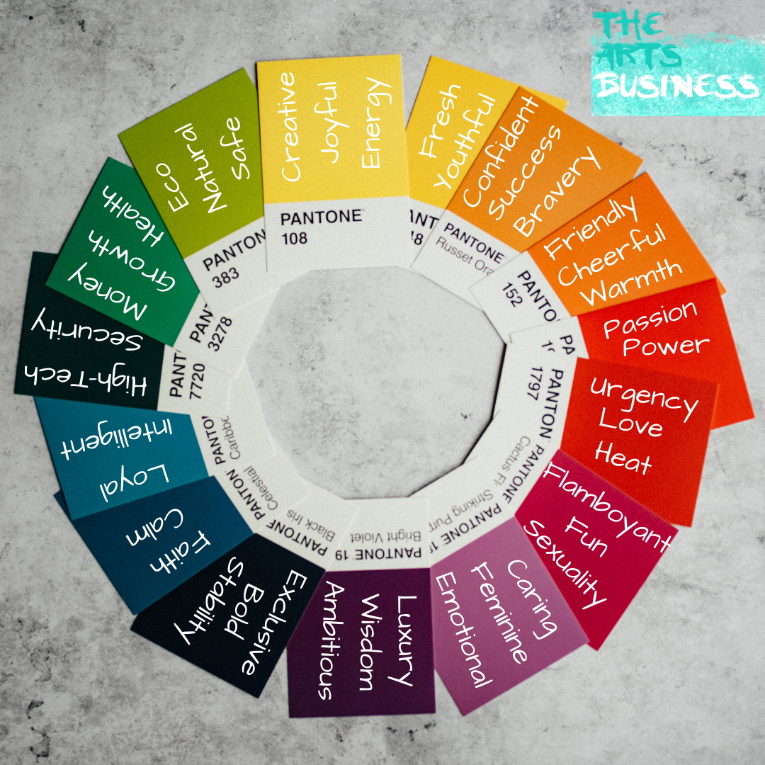
- Colours
In a nutshell this is the colours you want associated with your brand. It pulls your designs together. Be sure to include the:
- HEX code: a six-digit number used particularly in coding.
- RGB: it’s a mix of red, green and blue balance which dictates how the colour appears onscreen,
- CMYK: stands for Cyan, Magenta, Yellow and Key. This is the colour balance to recreate the exact same colours in printed materials.
Most brands include primary and secondary colours. Generally, (although not a rule) primary colours are those seen in the logo and secondary colours are used to compliment and offset those colours.
Some bigger brands even name their colour, so it is forever associated with their brand, for example: Spotify Green & Netflix Red.
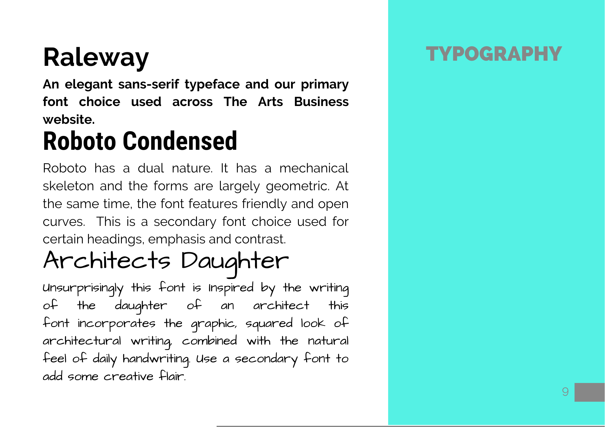
- Typography
Similar to colours these are the typefaces you want your brand to use. Give a description of each font along with what and when it is appropriate to use them. You can use the terminology primary and secondary here again to create a font hierarchy. You can also include information about font format and weight.
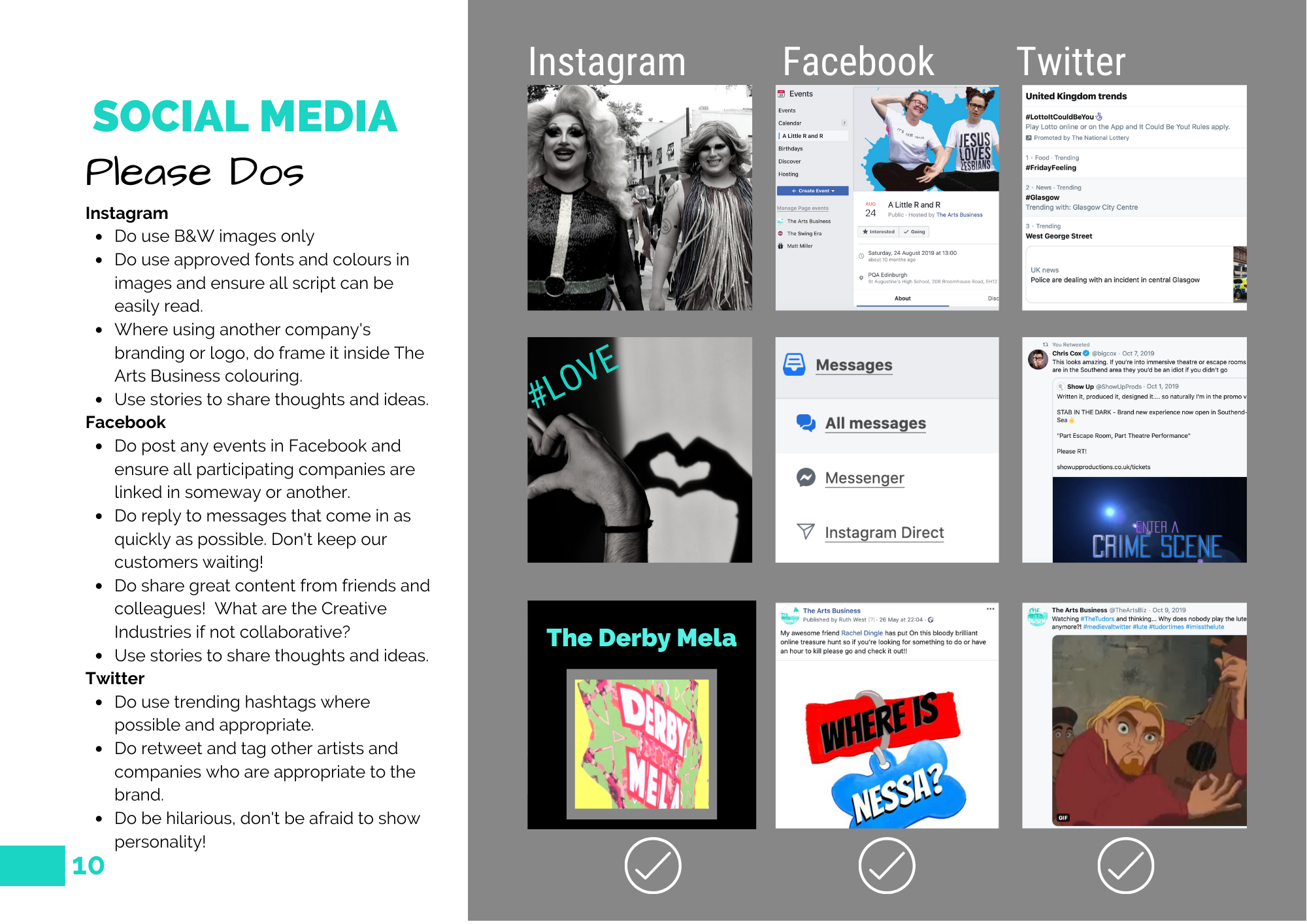
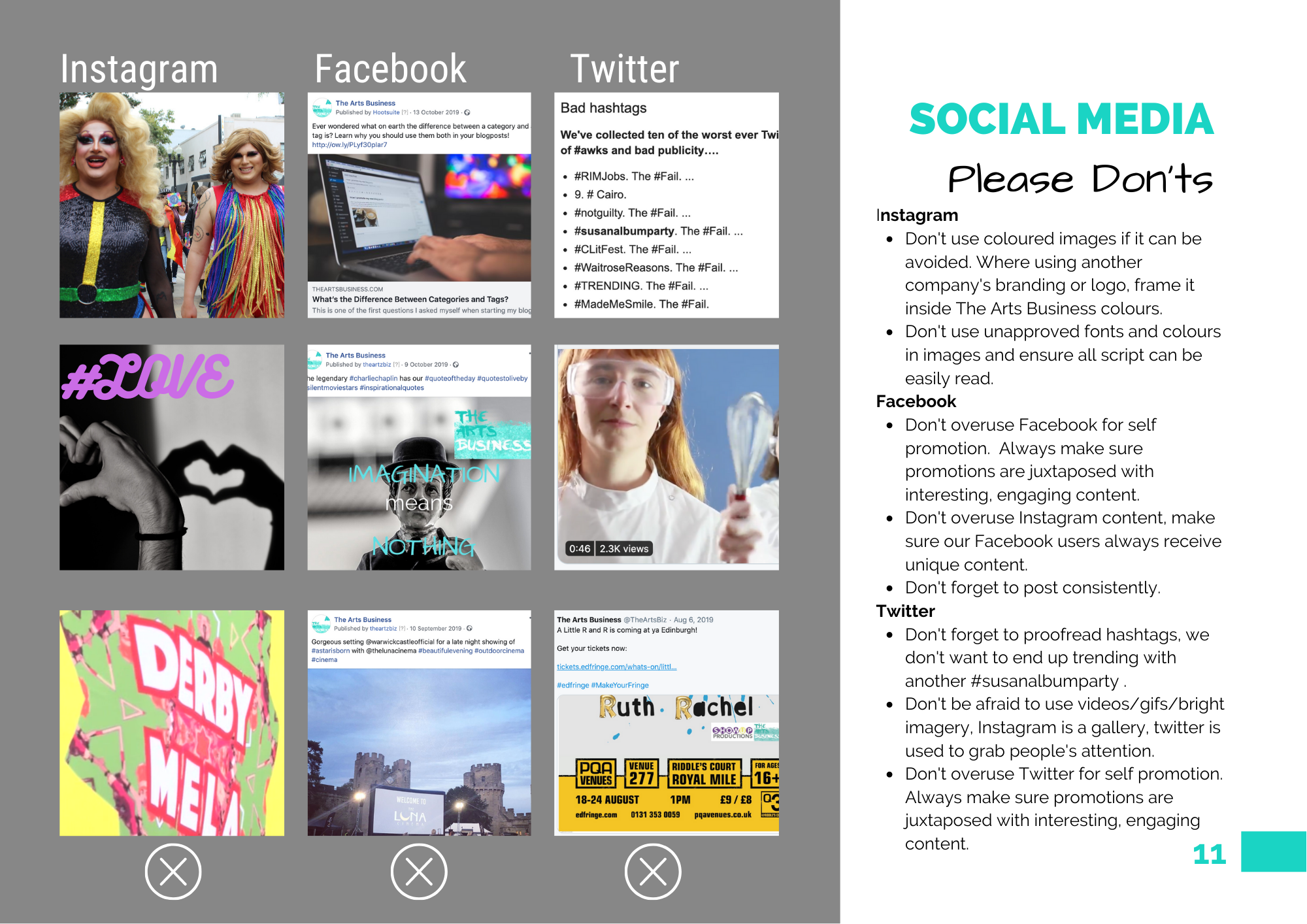
- Social Media
A relatively new addition to the Brand Book and so important it takes up two pages. This should show what social networks your business uses and how to use them in keeping with your brand. Remember your dos and don’ts and be sure to use some illustrative imagery to explain exactly what to do. Social Media is one of the most important platforms for your company’s organic growth so if you’re not sure what sites to use or how you should check out our previous post on finding the perfect social media platform for your business.
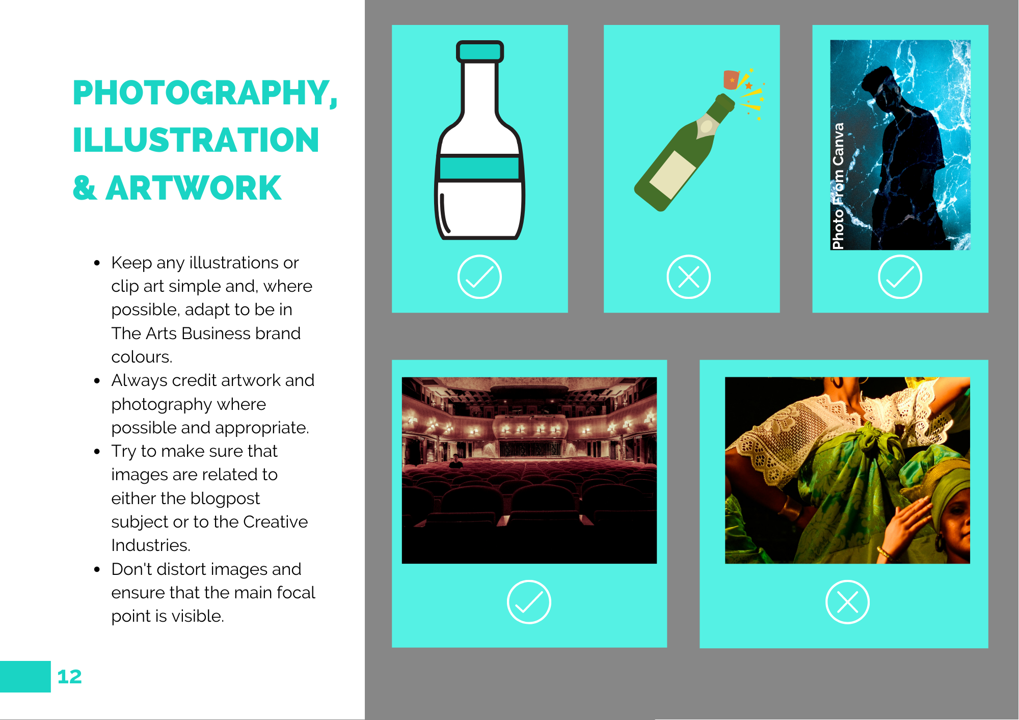
- Photography, Illustration & Artwork
The Arts Business has chosen to group these items into a single category to explain simply and efficiently how to use imagery throughout the website and any branded documentation. Should your Arts Business focus on any of these elements you may want to break them down into individual categories to expand on how you use them for company branding.
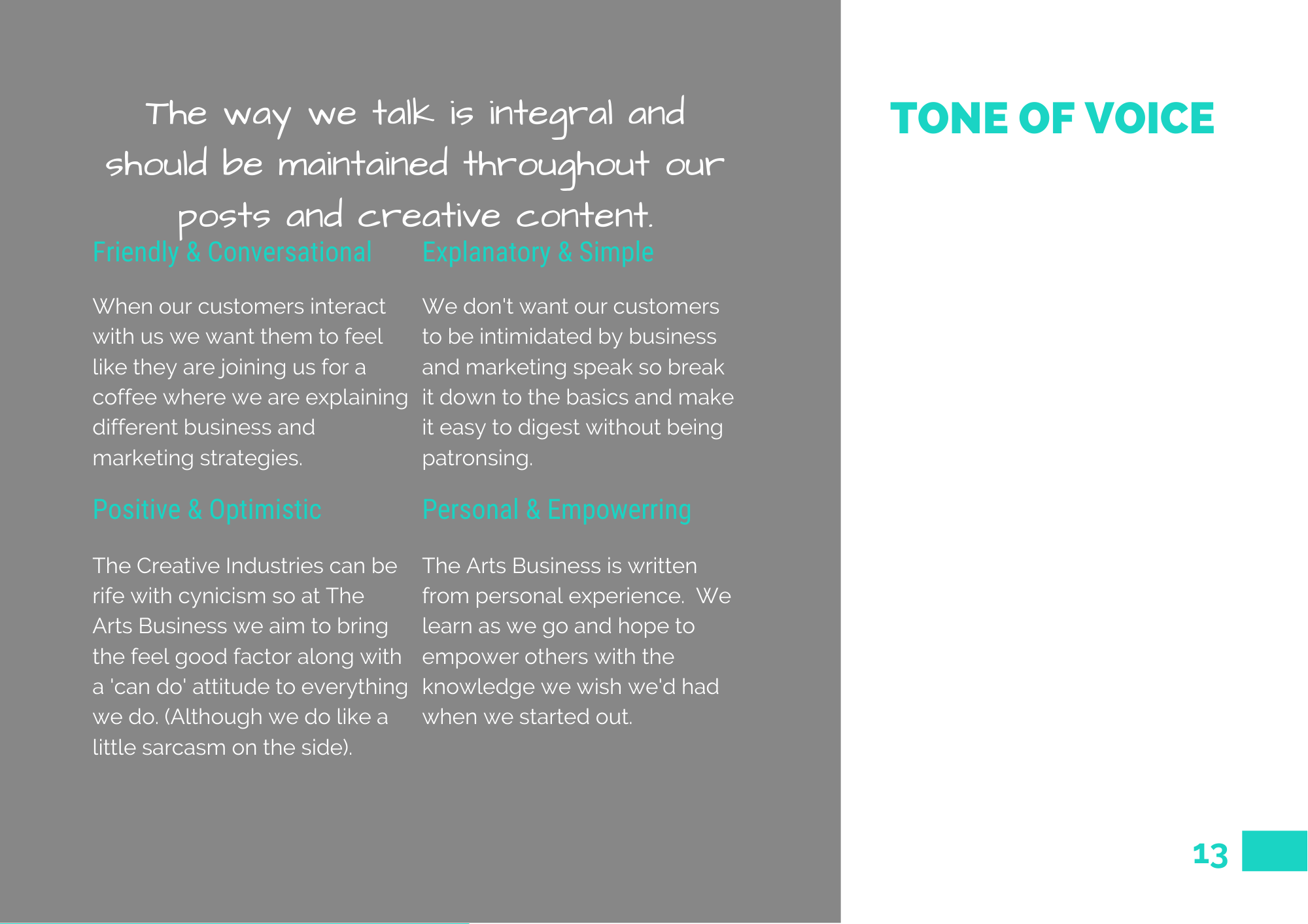
- Tone of Voice
This is how you want your content to come across. Are you professional and corporate? Conversational and friendly? Explanatory and informative? It’s up to you how you want your brand to be portrayed but think carefully about your target audience appeal when making this decision.
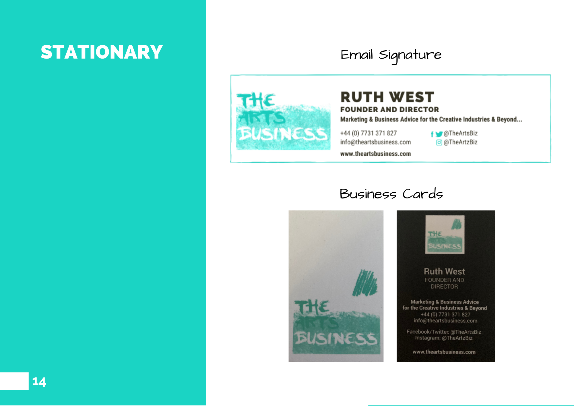
- Stationery
Stationery in this context includes branding like letterheads, email signatures and business cards. Pretty much any time your business presents itself in print. Use this page to show examples of your stationery and how you have incorporated your brand guidelines into the design.
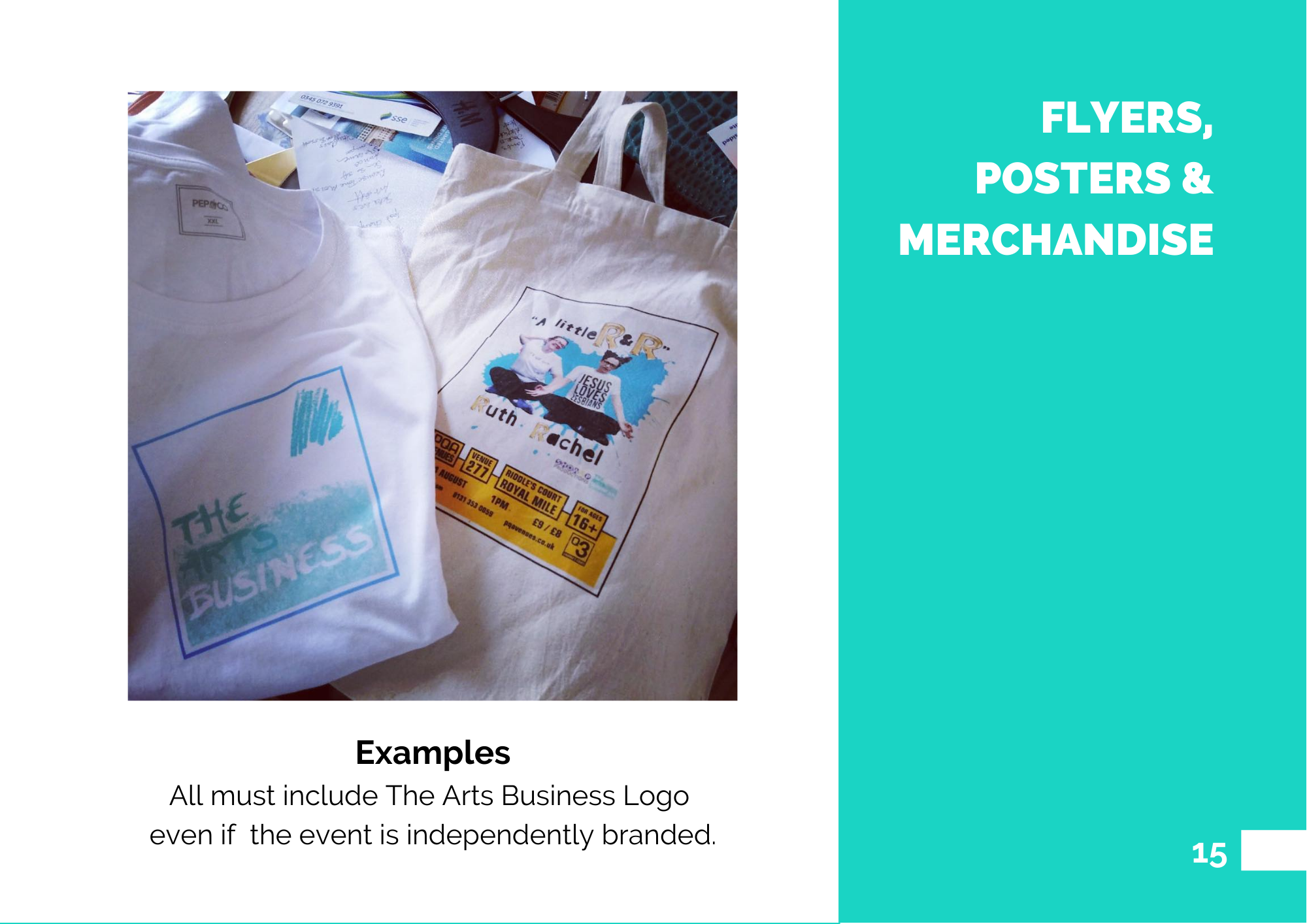
- Flyers, Posters & Merchandise
Similar to stationery I have shown examples of flyers and merchandise The Arts Business has produced in the past to suggest how the logo might be used.
- Contact Details
Self-explanatory really! Whoever reads your Brand Book should be able contact you if they have any questions or simply want to congratulate you on a job well done!
I like to display my contact information in the same way:
- Logo – make sure it’s there somewhere, doesn’t necessarily need to be above but somewhere on the same page! I like to think that subconsciously this means that when someone sees your logo, they automatically associate it with you contact details springing to mind but even if this isn’t true it still looks pretty.
- Name and Job Title – not necessary to include with the Brand Book but if you think it is applicable to the document go for it!
- Tagline – As I explained previously the company’s tagline is kind of like a one sentence pitch or explanation of what you do, so I try to include it at the beginning or end of official company documentation to remind anyone who may be reading it exactly what we do.
- Phone Number,Email Address, Social Media, Website – make it as easy as possible for the reader to contact you should they have any questions.
- Optional Extras
- Brand Journey – your company’s origin story and brand history
- Composition – how to arrange company documentation
- Iconography – specifically about little, simple icons used throughout your branding
- Animation and Video – should you include video content frequently with your work, you’ll also wanna specify guidelines for these
- Product Line – should this be central to your brand, include it
There are loads of ways you can build your brand book so here are some links to awesome examples from companies of all shapes and sizes including:
Ultimately, don’t be afraid to get specific! Remember, it’s your business, your brand, your baby. It should be exactly how you want it to be!
Do you have a brand book to be proud of? Let us know! We’d love to share it.
Want The Arts Business to create a brand book for you? Get in touch.